Designing data interfaces
Many online government services are there to help people complete a one-off task, like applying for a benefit or renewing a passport. These can (and usually should) be made up of simple screens that step users through a series of questions to collect information and finish with sending that information to the government for some action to be taken.
But some services are more focused on presenting information back to the user, rather than collecting it from them. Examples include Check the MOT status of a vehicle and Find your MP.
This type of interaction is common in interfaces used by staff to find and update information. In these systems it’s not uncommon to see screens that are just stylised representations of the underlying data, instead of being built on an understanding of user journeys and tasks.
As a GDS blog post from 2015 puts it:
“When designing an admin interface, it’s easy to just show database rows on the screen with buttons to add, show, edit and delete records. Don’t do this. It’s lazy.
Admin users will typically be doing specific admin tasks, and good admin interfaces will support these common tasks. It’s your job to figure out what these tasks are.”
As you understand more about your users, you can make your design more useful and valuable to them. You can move up a chain from representing raw data, to showing information, and then to making that information actionable.
1. Data
No user insight: represents the underlying data in a web page
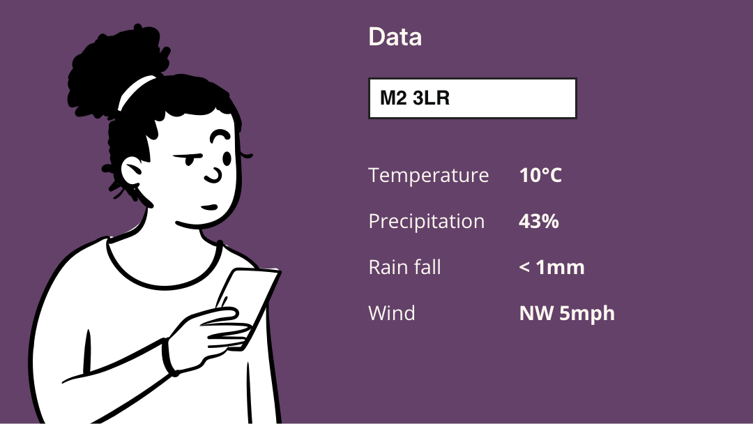
You don’t need any knowledge of your users, their needs, their tasks or their context to design a page that just displays the underlying data. You might style the page correctly according to the relevant brand guidelines. But you will be choosing what data to show based on the arbitrary structure of the underlying system, rather than on what the user needs to see at that moment.
Displaying all the data makes the user do more work to get the information they need, adding unnecessary friction and complexity. It also makes it harder to protect personal data because the default is to show everything.
2. Information
Some user insight: shows only the data that the user needs to see for their current task
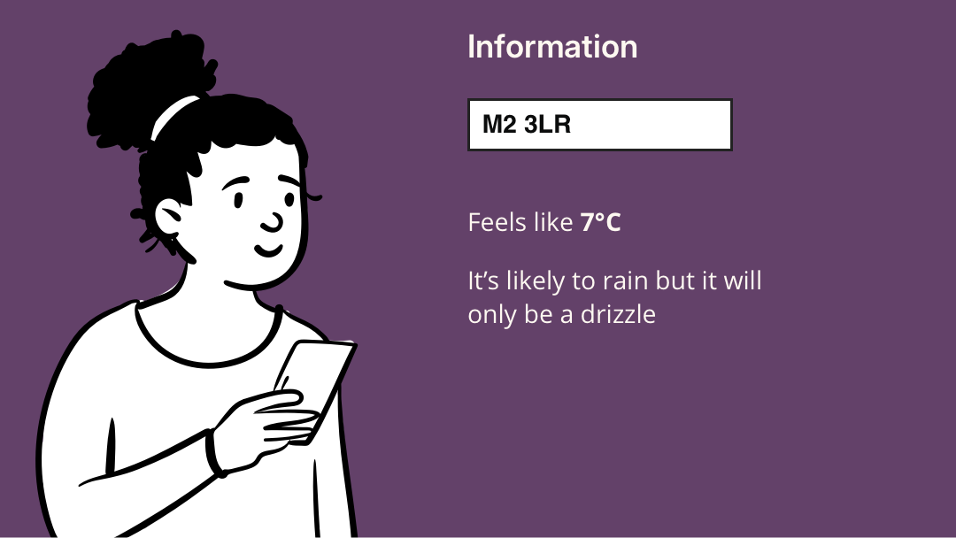
At the next level of maturity you have awareness of your users' tasks and are able to identify what data they actually need to see for each task. You can design a screen that shows only what they need to see in that context, filtering out unnecessary data.
You can also combine data to produce information useful to the task: for example, temperature combined with wind speed might enable a weather app to show a "feels like" temperature.
By making active design choices informed by user needs you move from displaying data to displaying information.
3. Actionable information
More user insight: uses context to make the information actionable
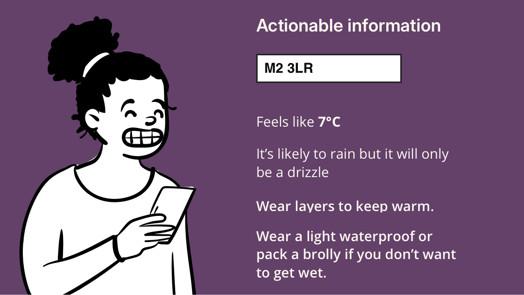
If you also understand the user’s wider journey and context, you can go further and suggest helpful next steps. This makes the information actionable.
At each stage you make your design less general and more specific to a user task and context – which means you need good information from user research and business analysis.
Summary
Simply representing the underlying data fields is a tempting design choice because you can do it with no knowledge of user tasks. It can even appear quite flexible: if the user can see all the data, they can in theory do any task.
If the resulting design is difficult or inefficient to use there are few immediate consequences – staff users don’t have a choice about which systems they use, so you won’t lose customers to a rival product.
But there are costs to designing without clear user tasks. The cost is passed on to other parts of the organisation, and ultimately to the customer, for example in:
- greater need for training and training materials
- more time taken to complete tasks
- more user error leading to lower data quality
If we move from representing data to showing clear, actionable information, we can reduce these costs and build better interfaces.
Could we improve this page?
Send questions, comments or suggestions to the DWP Design System team.